Duration: 8 weeks
TEAM: Personal Project
SCOPE: Product Design + User Research
Note: I became really invested with this project and decided develop it. I'm currently redesigning this product, adding more features,
refining the visuals, and developing it! Reach out to me here to learn more!
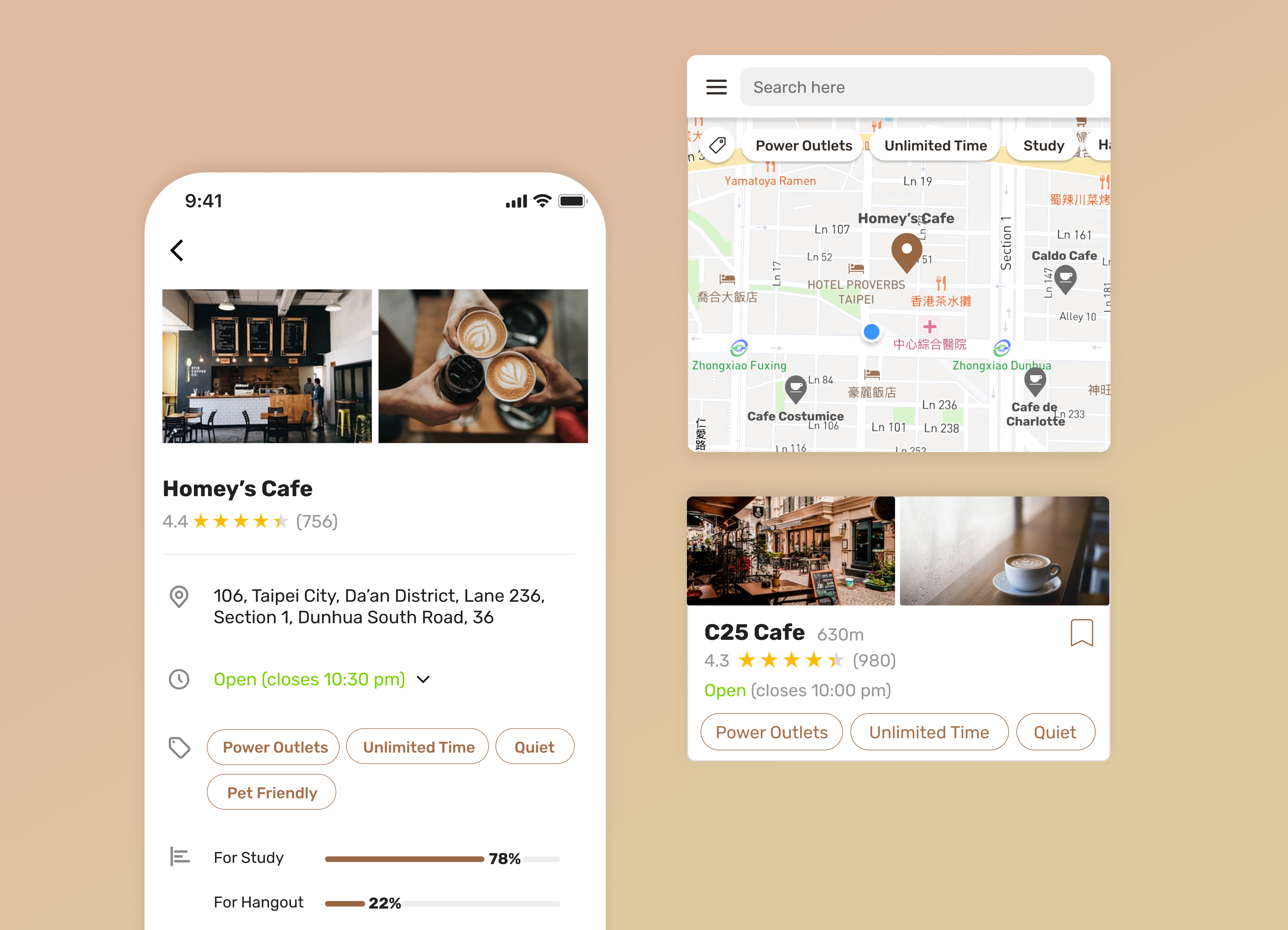
This mobile application is designed based on problems observed in Taiwan, where COVID-19 situations were not as severe and regulations were looser.
Since the pandamic, a lot of international students flies home and continue to attend university online. The demand to search for cafes suitable for studying anda working has increased. However, there lacks a user-centric app that helps these cafe goers explore cafes easier.
To address this problem, I created a Mocha: mobile app that helps cafe goers efficiently search and discover cafes that are suitable for their needs
I surveyed 24 participants and conducted interviews with 5 participants to gain a deeper understanding of cafe goers' behaviors and habits of how they currently explore cafes.
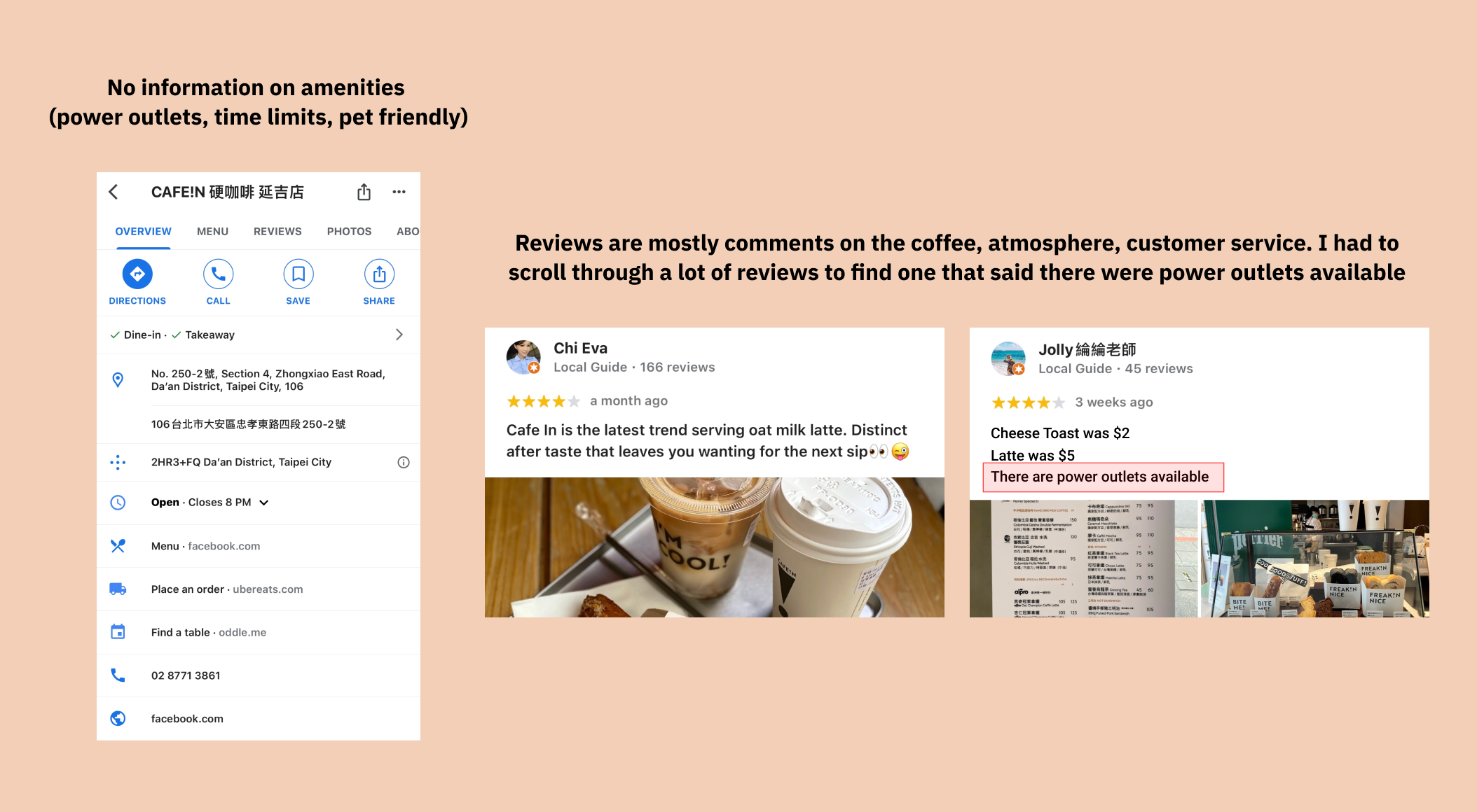
Difficulty with finding complete and relevant information
Users need to know if there are power outlets, speed of wifi, if pets are allowed, are there time limits? All of these factors
determine if a cafe fits the users’ demands. Incomplete information raises difficulty
and prolongs user's decision making process.
Almost 90% of users look for cafes through Google maps.
However Google maps would incorporate restaurants into the results, making it hard for users to extract information.
"The process is frustrating because when I see a cafe, I don't know if it has the amenities that I need, so I'll have to look it up myself. Sometimes that doesn't work either and I end up spending a lot of time searching for a cafe that fits my needs." – Cynthia
Searching process is very frustrating and time consuming
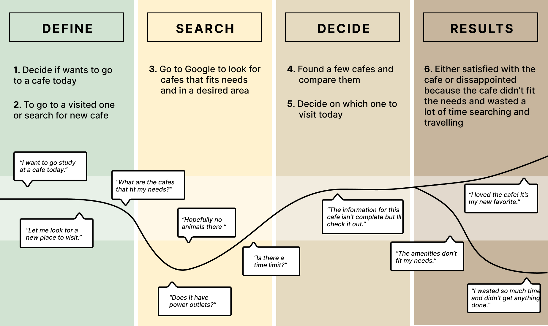
16 out of 24 users expressed frustration about how they currently explore cafes. Through the interviews, I was able to get a sense of how the current process is like:
Cafe goers are constantly on the hunt for new cafes
13 out of 24 (54.2%) users stated that they are always on the hunt for new spots because they don’t want to keep visiting the same cafe.
"Exploring cafes is a fun and exciting experience." – Samantha
Perhaps this is something that I could keep in mind while designing, making the process exciting and fun?
After learning more about the user needs, I looked into some other products on the marketing that serve a similar purpose.
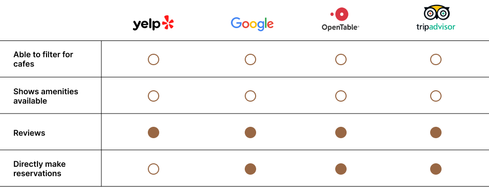
The available apps that are most popular amongst users are: Yelp, Google, OpenTable, and Tripadvisor. Even though they all have special
features that give them their competitive edge, something is missing. The goal of the product that I wanted to create targets the demographic
that have a need and want to explore cafes. There's currently nothing like this on the market.
As seen from the table, the competitors have features like, reviews, making reservations as stuff, but doesn't have anything that helps with the discovery and deciding stage of the user journey. I wanted to help users easily discover and decide which cafe would be the most suitable to their needs.
Concluding from the research insights and synthesis, the solution needs to...
1. Facilitate easier, simplier and more intuitive searching experience for cafe goers.
2. Contain and inform relevant and complete information about the cafes.
I aimed to create a MVP for now and improve upon it through iterations and usability testing later on.
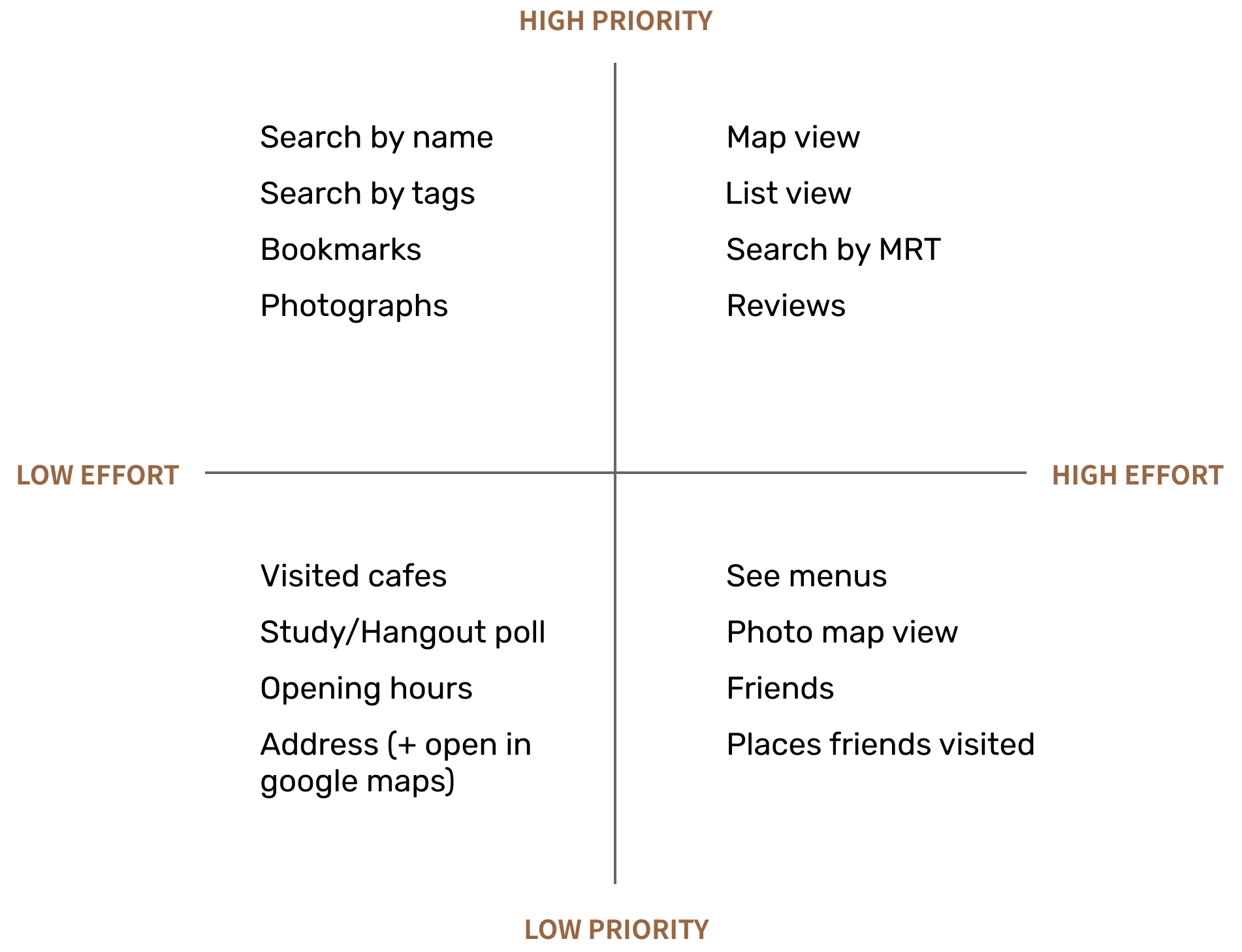
Since the goal at the current stage is to create a minimum viable product, I came up with a list of features and functionalities that are either present in other similar application or requested/mentioned by interview participants. I then sort them into a prioritization map to clarify the direction and scope of the product.
Creating a user flow map was very helpful for me to plan the user experience. I created this while keeping the design goal in mind: efficient searching and discovery
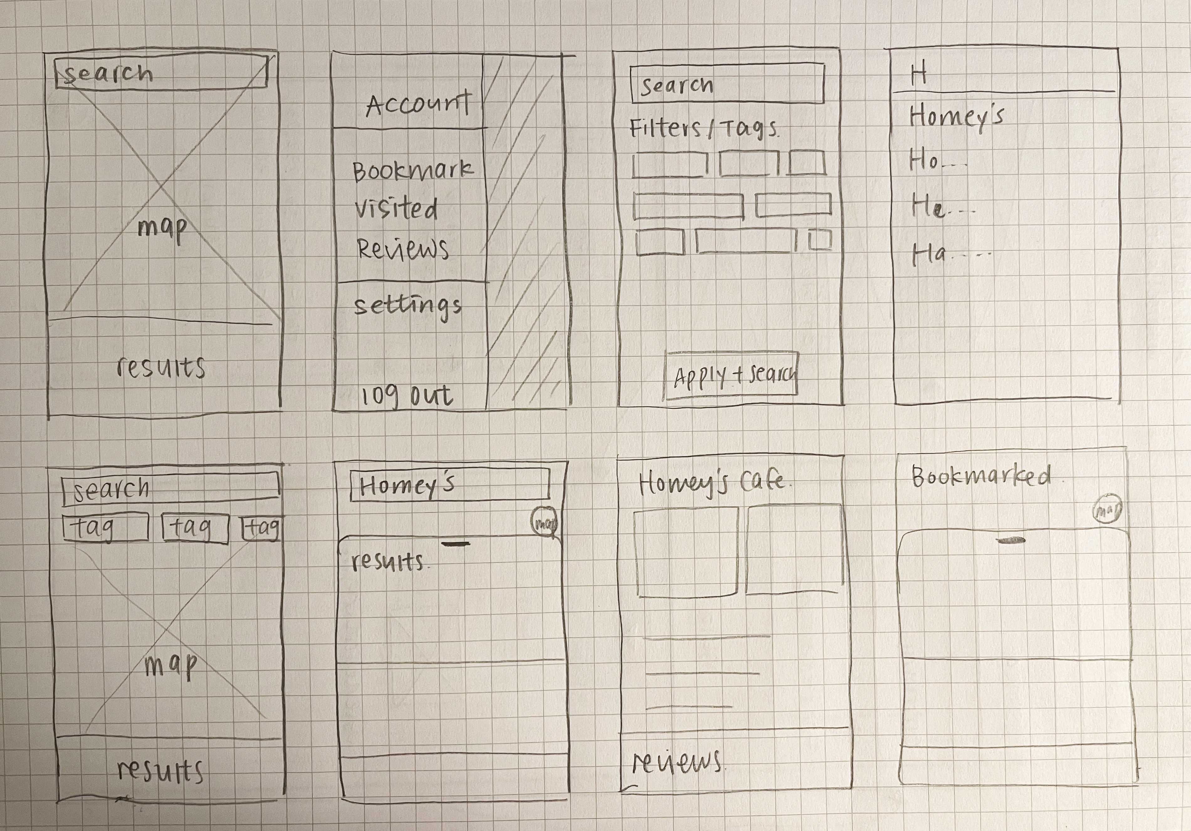
After creating clickthrough wireframes, I conducted user testing to validate the design and product direction. Based off the findings, I made some iterations to the user flow and screens.
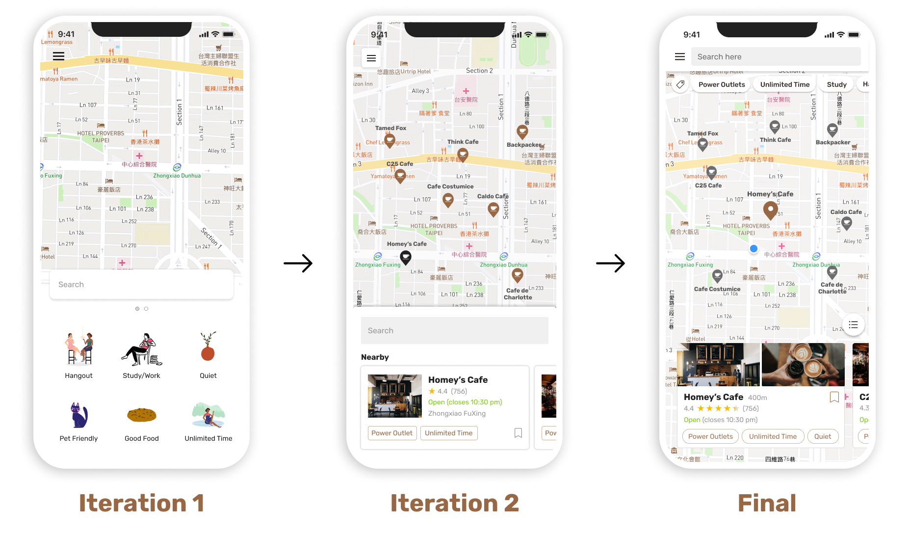
At first, the approach was to allow users to quickly see different categories of cafes. I later realized that this complicates the process. Based on the observation of user behaviors, location > Amenities but searching by amenities should be easily accessible as well. So I iterated the design to show cafes nearby with visible tags on top. I originally want the search field to be at the center of the screen for easier access but considering the fact that users are more likely to look at nearby cafes than search for a cafe, I moved it to the top.
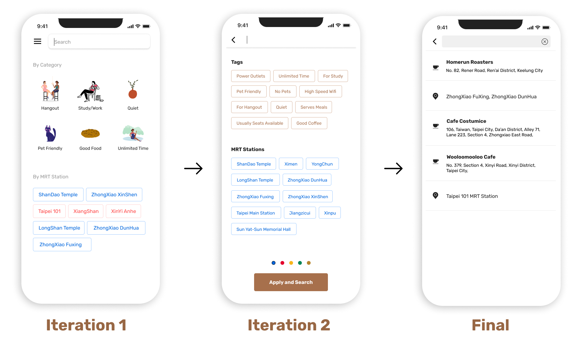
For the initial design, the "amenities" are organized in categories as a collection of cafes recommended to the users. And then users could apply filters to narrow down the search results. As the second iteration, I decided to get rid of categories and just allow users to search immediately through tags/filters instead. Eventually, as the tags/filters were moved to the home page, I got rid of them in the searching process and displayed previous searches instead.
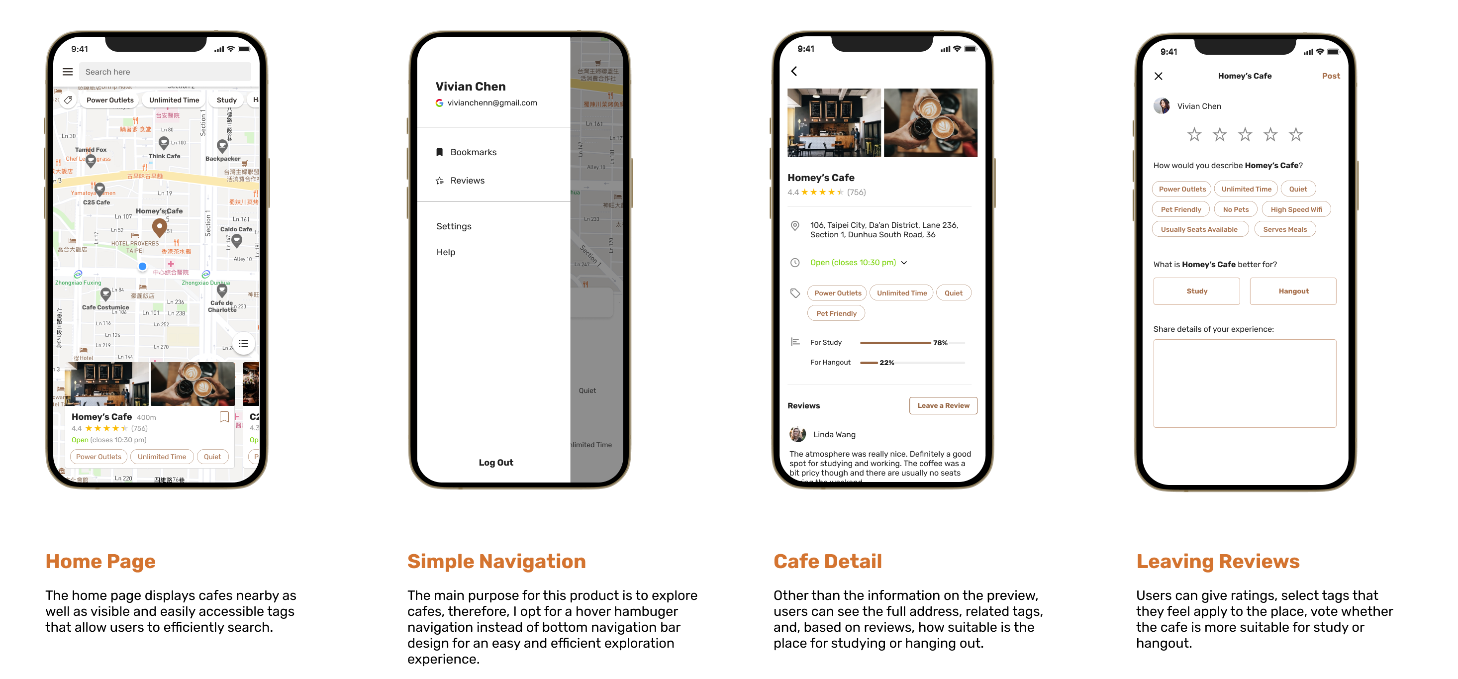
When I was designing the navigation, I realized that having a navigation bar at the bottom isn't necessary since the purpose of this product is for users to search and explore with ease. It's easy to fall into the pattern of thinking some elements are necessary but when you take a step back and think about what users really want, a lot of elements can be eliminated.
The process of design isn't a straight line. Sometimes, even after conducting proper and complete research and analysis, more discoveries might appear later on in the stage of design. Hence why I had to make changes to the user flow, something that's completed in the early stages of defining the product. I think it's important to realize that changes are a normal part of design.
I really enjoyed designing this product and I would consider adding more features and actually building this product and pushing it to the app store in the future.
NEXT