Duration: 3 weeks
TEAM: Personal Project
SCOPE: Product Design + User Research
Using iPhone's screen time function to track notifications from each app, I found out that I receive around 300 FB messenger notifications a day. Some of my friends receive around 500 or more notifications per day. In the midst of so many messages, trying to find the one specific message containing important information becomes almost impossible.
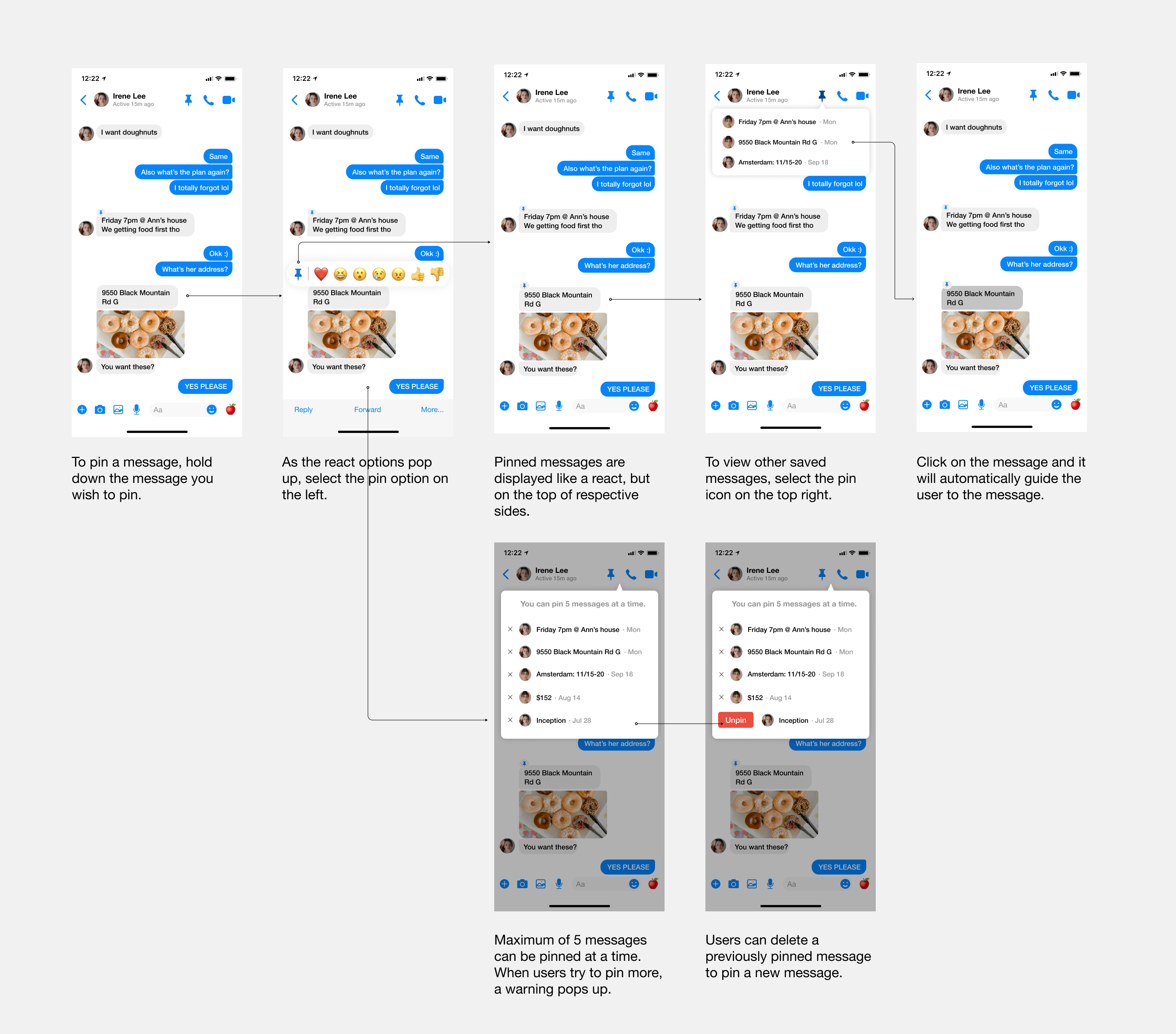
I ideated a feature concept that allow users to pin important messages in chatrooms so they can easily find them in the future.
I wanted to uncover how people navigate the app, their behaviors and habits, and struggles that contribute to the problem. I interviewed and observed 5 frequent FB Messenger users, here are the key findings:
1. Users don't engage with the "search in conversation" feature
They forget that this feature exists and when they do try to use it,
they can't recall the specific word/phrase used, therefore unable to find the message.
2. Need to recall instead of recognize.
In order the find the message, users have to the "time" of which the message was sent
(i.e. in which section of the chat were they talking about this topic), then scan through all messages within the "section" to find the message.
3. Important messages that users would like to find are mostly plans and addresses.
It is to my surprise that people don't really have the need to save "heardfelt" messages, like birthday or anniversary messages.
Moving on to thinking about how to approach and solve the problem, I sketched out some ideas based on research findings. The recurring idea was "faster and easier". This means that I had to create something that's easily accessible by the users, doesn't take too many steps to complete, and minimize the effort needed for maximum value creation. With that in mind, I came up with 3 opportunities to explore further.
I wasn't sure which one is the better approach, so I turned to my users. I also asked users who regularly use other message apps that have features similar to notes to get an insight. Turns out that the need for a note feature isn't high because A) it's not clear what types of content they would put in notes. B) If they were to put something in notes, there wouldn't be a lot. Most of the time, users still choose to put information in chat and access them from there.
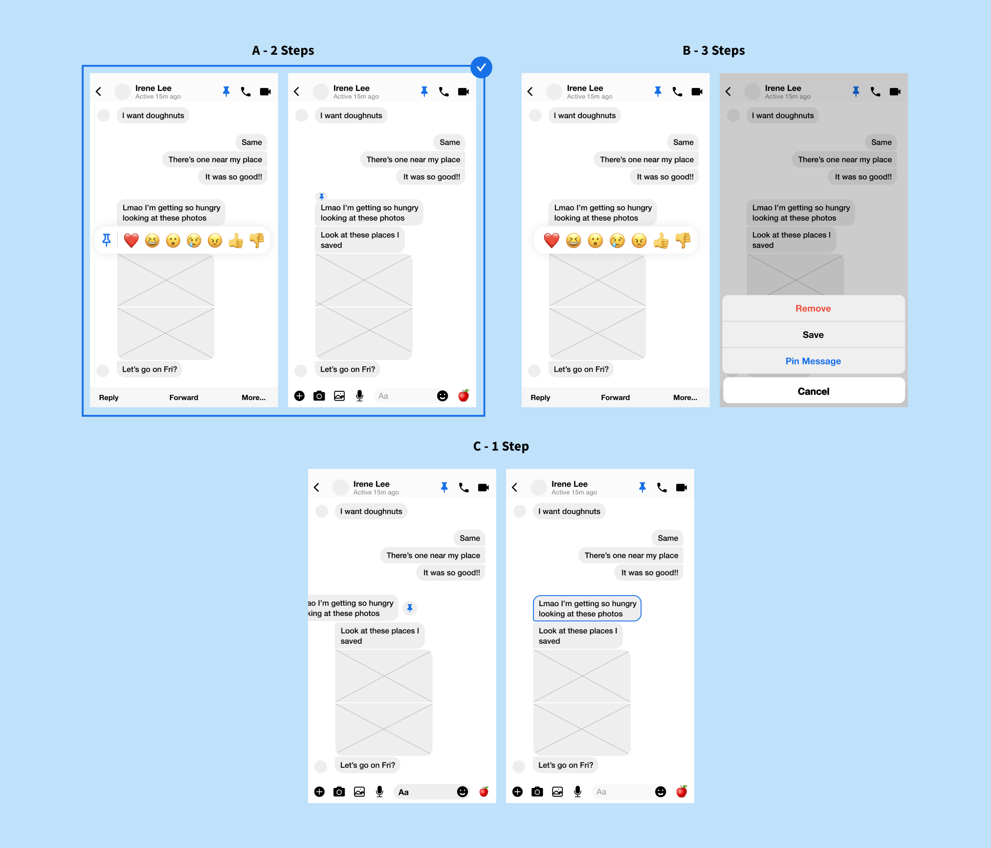
What actions should the user take in order to pin a mesage? How can the pinned messages stand out without getting in the way of current chatroom designs? How should the relationship between pinned messages and entry point be shown?
After usability testing, I concluded that design A is the better solution because it requires the right amount of steps for users to complete this goal. Users press and hold the message that they wish to pin, and select the pin icon option.
For design B, users would press and hold the message, select more, them select the option to pin. This isn't the best solution because it requires too much effort in relation to the significance of the goal. Whereas for design C, users swipe the message to pin. This isn't the best solution either because users could easily get confused with what they would get when they swipe in each direction (reply vs pin), especially when users swipe to different sides when they reply to their own message and the other person's.
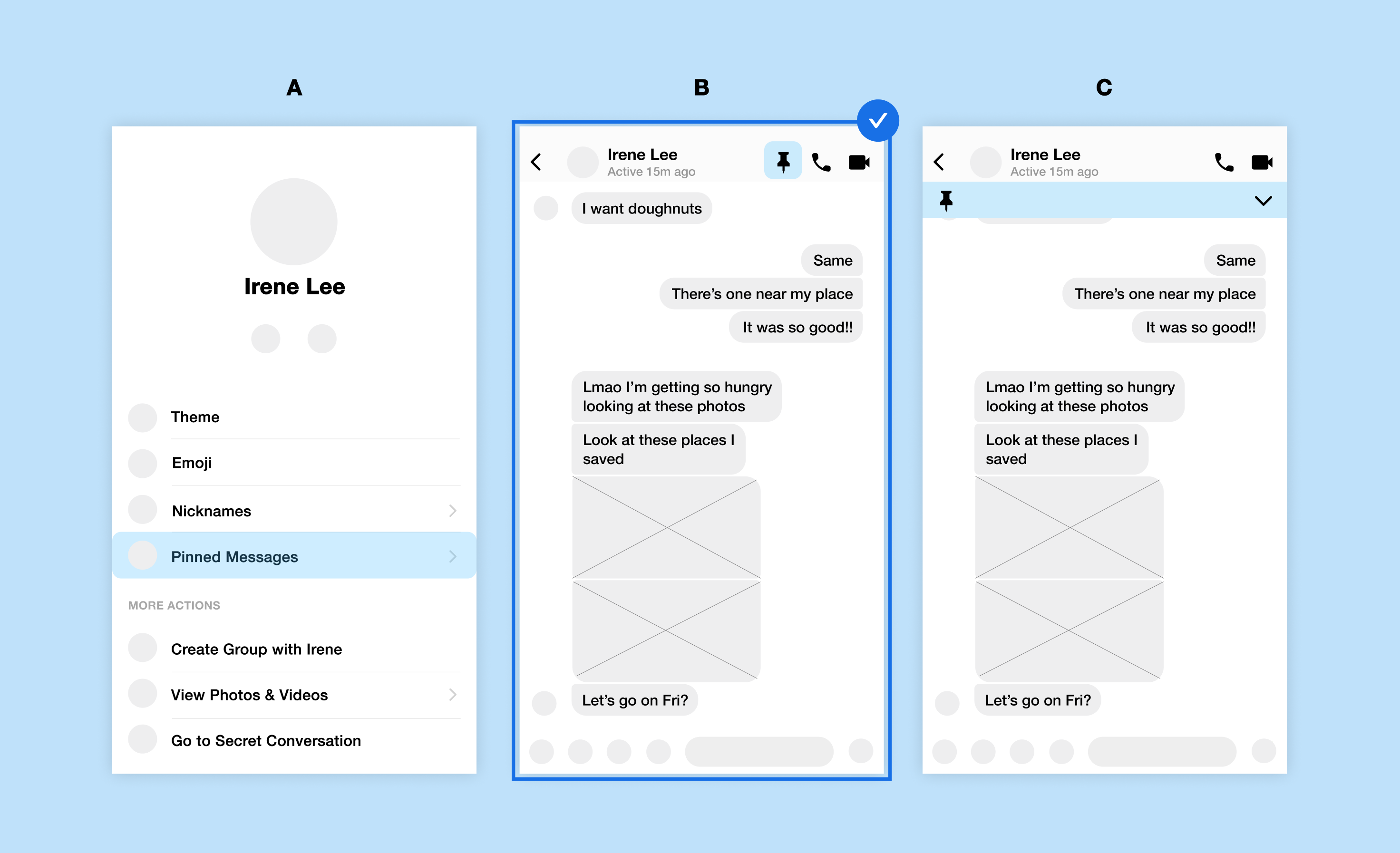
How can the entry point be displayed for easy access and not increase cognitive load? How many steps should the users take to get to the entry point?
Design A, users take 2 steps to access the archive. This makes the message feel more of high importance, like notes, instead of just pinning them for later use. This would trigger users to pin as many messages as they want since there's even a separate archive for them. Design C displays the pinned messages like announcements. The pinned messages are visible by default so that users don't need to find them on their own. But I soon realized that this actually takes up a lot of space and unnecessarily increases the cognitive load for users. I chose Design B. Messages are hidden initially and are shown when the icon is clicked on, provides instant access, a popup-like block would allow the users to think twice before pinning a message for a curated selection of messages.
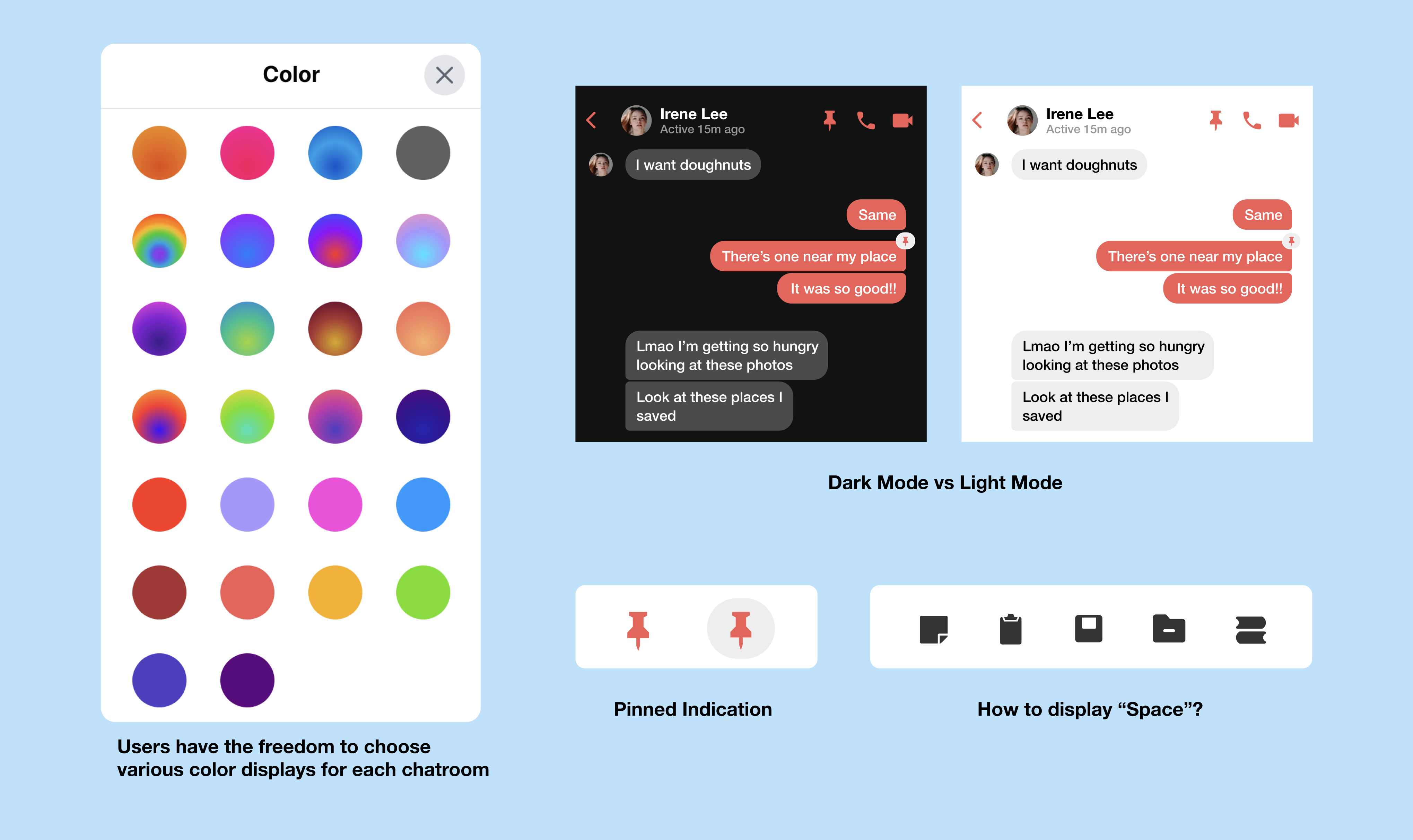
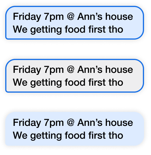
I thought about indicating pinned messages changed colors of message boxes and outlines but given that Facebook Messenger gives its users a lot of freedom with what they wanted their chatrooms to look like, the change of colors would have made the chatrooms too messy, so I opt for a cleaner color and design.
While working on the project, I found myself sometimes being unsure of the decisions I've made which caused me to taking a long time to keep going back and re-iterating and re-explore my options and ideas. I had learned to sort through which implementations were necessary and trust my instincts. Having the courage to try and fail is always better than being too afriad to try at all.
I started this project with one goal in mind, to make the experience of finding messages easier and more efficient. But I got sidetracked a lot which made me spend time exploring other problems. I eventually realized that if I continued to work on the project with a mindset of needing to solve everything, I wouldn't get anywhere. In the real world, there are business, technological and resource contraints where I would have to decide on what's important to work on first.
NEXT